Why should your annual spring clean stop at your physical space and not extend to your digital one? For the month of April, Minty Pixel has been encouraging small and mid-sized businesses to take stock of their websites and give them a glow up for the coming year. But before you start planning out a set of fancy new graphics and elaborate pages, give these tips a read. When it comes to websites, an effective makeover has more to do with optimization and simplicity than it does sleek imagery and modern layouts.
Refine Messaging
When it comes to web copy, I like to consider the three ‘Ms’: mission, message, and mechanics. Let’s break these down.
Mission refers to the actions you want a visitor to take. What journey do you want them to go on? Where do you want them to end up? For the vast majority of companies, this means sales or contact. Now look at your existing homepage and ask yourself if it helps fulfill this mission. This means your homepage should have a clear and prominent CTA. Your global navigation should also make it easy to contact you, browse your store, etc.
Your message is where your mission meets your audience. Who are they and how do you appeal to them such that they take the intended action? This means making sure that you are talking TO and ABOUT your audience and not just about yourself (although both are important). This also means showing that you have some understanding of what your audience cares about and needs and are able to connect the dots between that and your product or service.
Finally, we have mechanics. How well crafted is your messaging? Are there typos or organizational errors? In this section you can also assess the locations and efficacy of your calls to action (CTAs). Make sure they are easy to find, easy to understand, and speak to your message and mission.
Review Global Navigation
Your global navigation (global nav) is more than just the “menu” for your site. It’s also your visitor’s main guide. At this point, we’re all trained to look to the top of a landing or homepage to find shortcuts to various key website elements (store, contact us, about us, etc.). But it can get complicated when global navs get overfull, and frustrating when they are over-sparse.
Tips for organizing your global nav:
- Prioritize your pages – Not everything needs to be included. Some can be added at the bottom of the homepage.
- Group your pages – Do this if you have a large number of pages you want to prioritize. Categorize them in a way that makes sense.
- Keep labels simple and accurate – Don’t over explain with lengthy link titles. Also don’t rely on clever catchy phrases. Be clear and straight-forward.
- Check all links – Make sure no global nav links are broken.
Don’t rely on the global nav to get your visitors where you want them to go. It is an important tool, but doesn’t take the place of having clear buttons above the fold with equally clear CTAs. An effective homepage will have both.
Improve Accessibility
Building an effective user experience extends beyond just making the site easy to navigate with clear CTAs. Remember that not everyone visiting your site will view it the same way (literally). Those with color blindness, dyslexia, or general vision challenges need some additional consideration.
What to consider when making your site more accessible:
- Color Contrast – Something that reads easily to you may not read easily to others. Make sure your important text can be read regardless of color blindness. High contrast helps, but the best way to ensure color blindness accessibility is by using a color blindness app that allows you to view your site through the lens of someone with various forms of the condition.
- Button Sizes – Larger buttons help both those with poor vision by allowing you to highlight important CTAs with larger text and those with dexterity issues in their hands that might struggle on touch screens to select a small button accurately.
- Alt Text – Alt text provides a text-based description of an image. This makes your content more accessible to those who might rely on screen readers for internet use due to vision challenges. Additionally, alt text benefits search engine optimization (SEO) by making it easier for web crawlers to understand what images portray for the purposes of search engine rankings.
- Spacing – Don’t crowd your website, plain and simple. Choose a font that’s easy to read and make sure there’s an appropriate amount of spacing between letters and lines.
The general rule of thumb here is that accessible to you does not mean accessible to all. Think outside the box (and your own experience) to build a website that’s effective and informative for ALL your visitors.
Streamline Forms
Forms are a great way to capture contact information from interested visitors. However, they run the risk of turning people away if they are too lengthy or cumbersome to fill out. What’s more, larger forms sometimes run into performance issues if they put high resource demands on your website, causing it to load more slowly and increasing the risk of errors. During your website spring clean, take some time to evaluate and optimize your forms.
Building an optimized form starts with a little backwards design. Ask yourself what you want your form to accomplish. Are you looking for people to sign up for meetings? Subscribe to a newsletter? Are you gating a piece of high value content for them to download?
Next ask yourself what bare minimum amount of information you need in order to accomplish that goal. Sure, it’s nice to have individual job titles and phone numbers, but are those truly essential to the task at hand or can you get away with a simple email address?
Finally, if your form fill process involves multiple steps, make sure you’re upfront about how much your visitor should expect. This can be a very effective way to group data in certain situations, but you have to be transparent. Visitors are not necessarily opposed to filling out a form with multiple submissions, but if they are caught by surprise and feel there’s “no end in sight”, they’re more likely to bail.
Optimize for Search Engines
Some of the items we’ve addressed, like alt text, contribute to SEO, but there are some other measures you could be taking to improve both your SEO performance and your user experience.
Start by making sure any photos, videos, or other graphics on your website are properly compressed. It is possible, for example, for your header image to have unnecessarily high resolution. At a certain point, the human eye can’t reliably distinguish between images that are both high (but different) resolutions. All your extremely large image is accomplishing is slowing down the load time for your site and frustrating visitors. Well, that and “frustrating” web crawlers that find your website difficult to read. TinyPNG is a free tool for compressing image files. For larger sites, you’ll want to use an image CDN that will automatically adjust the size of the image being displayed based on the visitor’s screen, so you won’t have to adjust anything yourself.
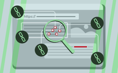
Then take stock of your internal linking. Internal links are a great way to help web crawlers read and map your website quickly. Broken links interrupt this process and negatively impact your SEO ranking. Broken links also make for a poor user experience if they prevent visitors from getting where they need to go. Checking all your links may sound onerous, but there are tools through applications like SEMRush that will provide you with reports on broken links, helping you narrow the search.
Optimize for Mobile
Your website has likely gone through numerous adjustments over the past year. Have all those adjustments been checked against mobile devices? While you don’t want to wait for a spring clean to ensure mobile friendliness, there’s no time like the present to double check the mobile user experience. After all, more and more people are relying on their mobile phones for social media, web browsing, and shopping.
Web hosting services like WordPress, Squarespace, Webflow, and Hostinger make it easy to view how a site should appear on mobile phones and tablets. When doing this (or just visiting the site on your own mobile phone), consider the following:
- Layout – How do your blocks arrange themselves in a mobile setting? Does it still make sense or are things misaligned and out of order?
- Button Size and Location – Are the buttons still associated with the right images or blocks? Are they easy to read and select?
- Navigation – How does your global nav menu appear on mobile? If there are any dropdowns, how do they look when activated?
- Forms – How do your forms look and how well do they perform? This is another place where shorter, more streamlined forms are better.
Realistically, you should be making this a habit every time you make changes to your site. However, if it hasn’t been top of mind, there’s no better time to start like the present.
Tools to Consider
We already mentioned tools like SEMRush for identifying and correcting broken links and TinyPNG to reduce image sizes. Also consider A/B testing to determine the efficacy of different CTA’s and other messaging on discrete landing pages. Heat mapping can show you where people are hovering when they visit a page and whether or not they are scrolling. The list goes on.
OR you can consider working with a dedicated team of marketing professionals who can help analyze your website needs, offer advice for making changes, and even get in there and get it done as needed. Book a free consultation with Minty Pixel to learn more.

0 Comments